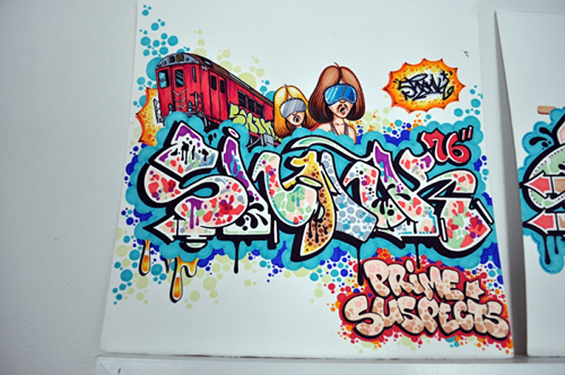
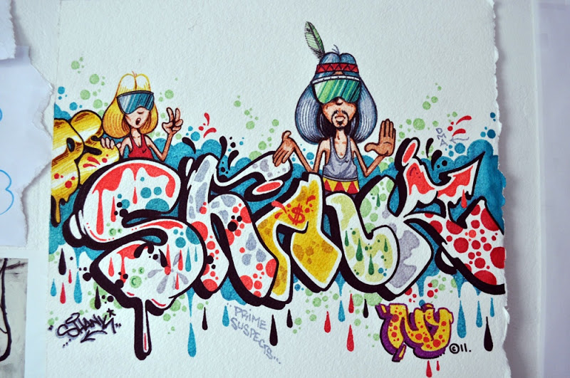
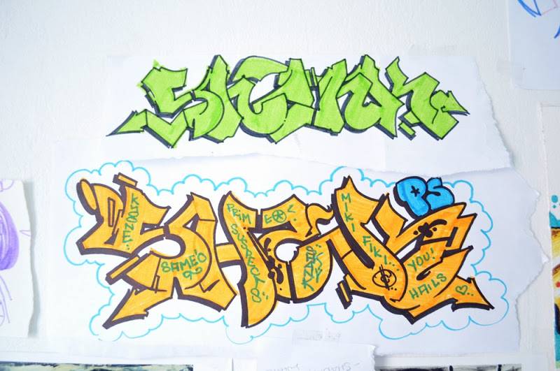
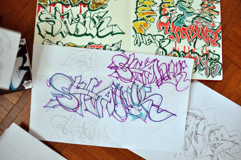
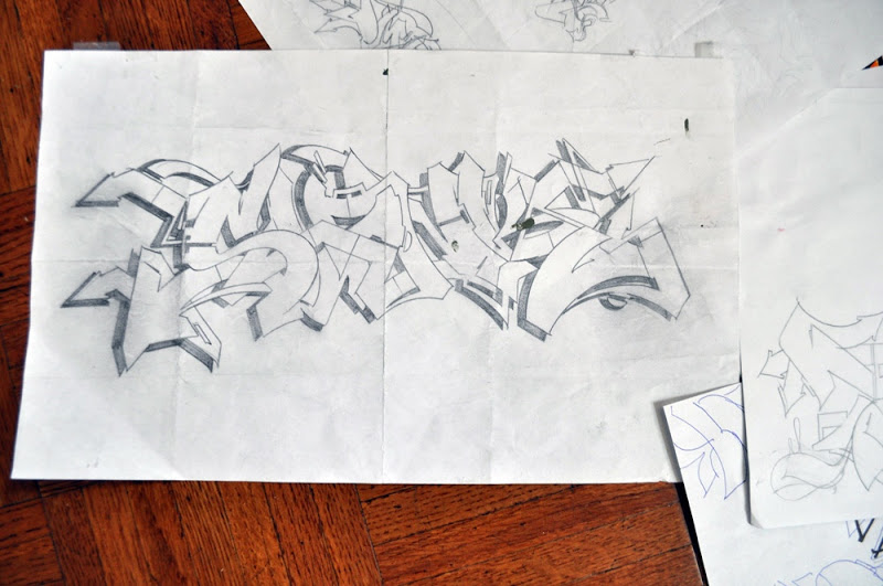
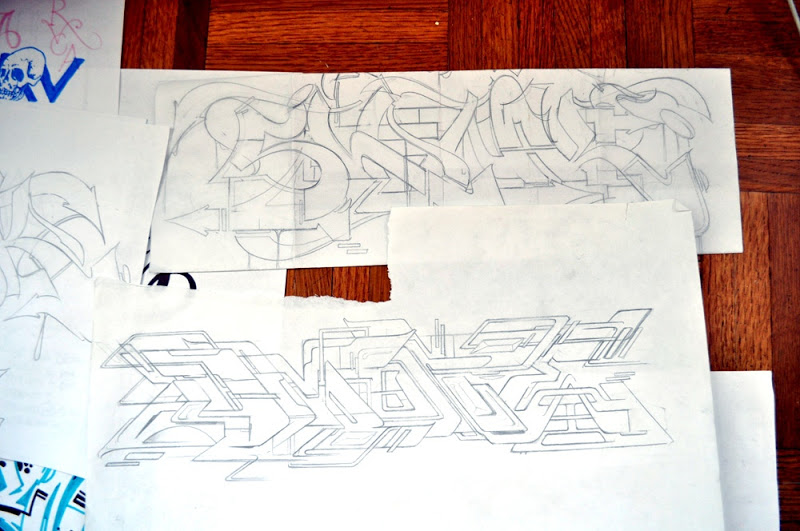
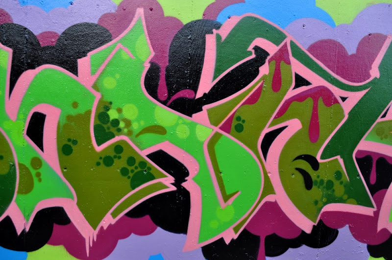
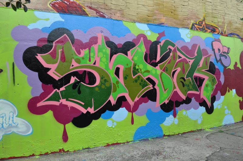
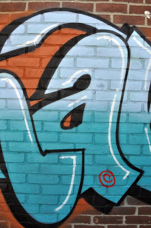
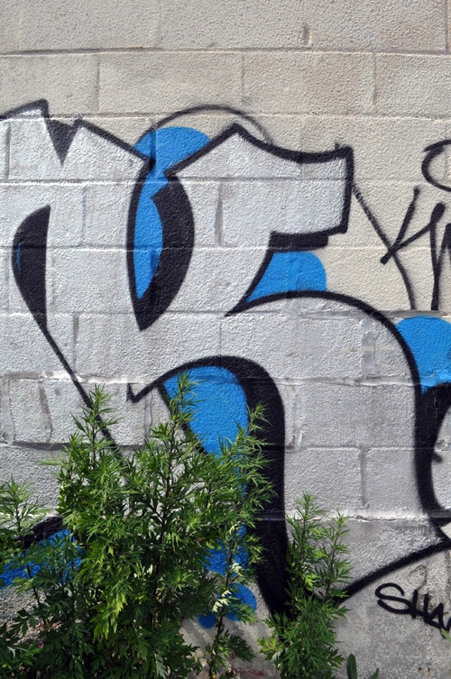
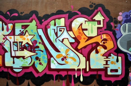
DMOTE was recently approached by “The Expresh Letters” blog for this short interview.
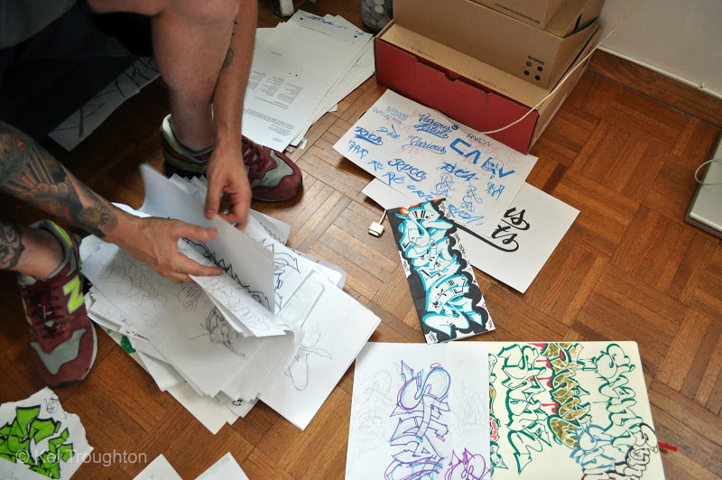
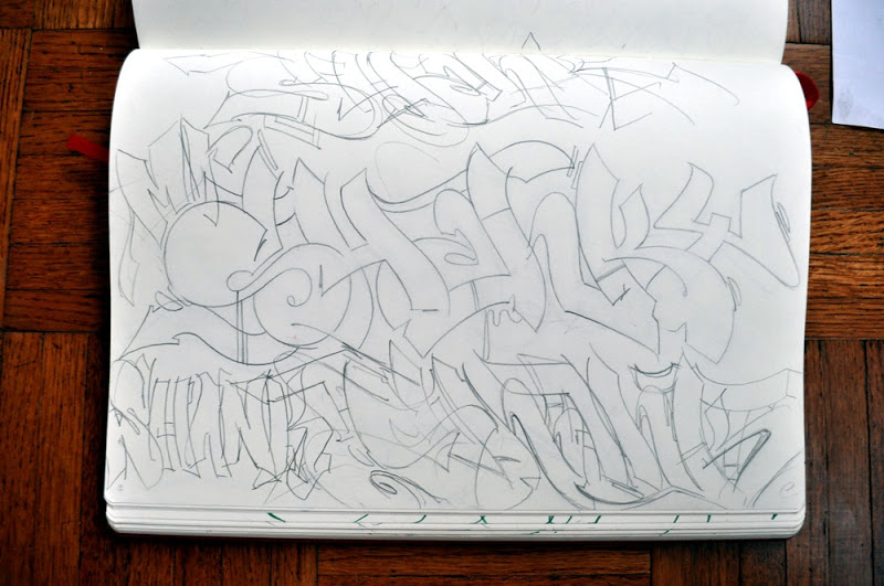
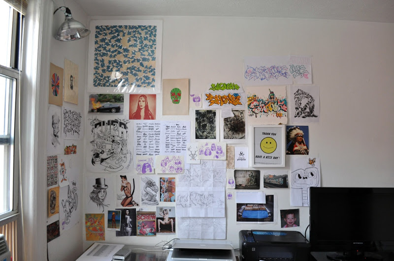
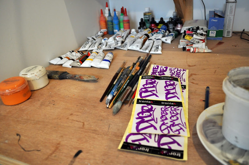
I linked up with Dmote on a New York trip this summer to photograph his studio space and talk letters. I’ve been a fan of the Sydney based graffiti champ and fine artist since about 2000 because of access to Australian graffiti magazines as a young kid (RIP Tower Records). The dude is one of the more classic graffiti figures I can think of. His work is always clean, all of his pieces have new ideas, hella friendly, and his style gives a nod to the classics. After a few years in New York and a ton of walls, he is just starting to get the recognition he deserves in the States.
Interview and photographs by Kel Troughton. Expresh.com 2011.
You started writing in 1984? talk a little bit about the influences you had back then, who were you looking up to, what kind of style were you interested in at the time?
“I started in 85 at age 15, at that point i hadnt been exposed to much graff/hip hop media, just the usual bits and pieces, so i was influenced locally, my high school had raised some good writers so they were the dudes i looked up to.”
I noticed you are into old cursive fonts and logos, what other kinds of typography are you interested in?
“Yeah i like hand drawn lettering a lot, for me its more human and interesting than computer generated fonts, they always seem to have something that not quite right, since moving here ive been more into the great american logos and lettering from the 50’s etc…”
What do you consider the characteristics to style on a letter? (how would you describe a letter with style vs. one without)
“The computer example is a good one, style – letters should fit together and make compensations for the letters around it, like extending a nice swoosh on an R or pinching and stretching certain areas to make the negative space work and become less regimented, the computer spaces strangely and all letters are to a grid so they become stiff and cold.”
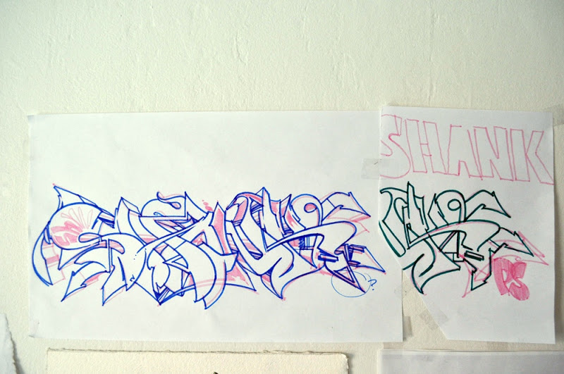
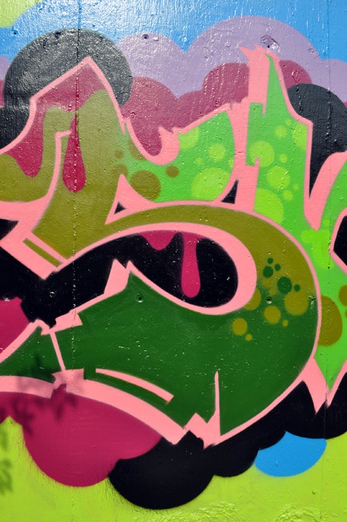
Critique a recent piece:
“Ok theres not much to the piece below, its pretty simple, in saying that its easy to fuck the simple styles up, im trying to make these ones perfect, its inspired by the tmt, tds era, tmt’s black cloud cars, the actual letters themselves im happy with, not perfect but ok, the bottom end of the ‘k” could be bigger and i fucked up the flow of the arrow because i couldn’t be bothered to find a crate, and i could easily add more swing and movement to it.”
More info:
– ExpreshLetters.blogspot.com
– Dmote1.wordpress.com

